Introducing our new series of blogs exploring social investment data visualisations.
At Big Society Capital, we have now been making social investments for five years and recently reached the milestone, along with our co-investors, of £1 billion committed. More than half of that is already drawn down and being used by charities and social enterprises to help improve lives.
But curated examples and impact reports only give some of the picture. We believe that broader transparency on activity is crucial to developing social investment. As part of our transparency initiative, we consulted on what data would be useful, and have been supplying it with significant help from our partners. Now inspired by the likes of Information is Beautiful we are launching visualisations that allow users to follow their own paths of enquiry through our data.
Our data dive series kicks off today with a look into that initial £1bn of Big Society Capital committed investments with co-investors and some thoughts on what we have been aiming to achieve.
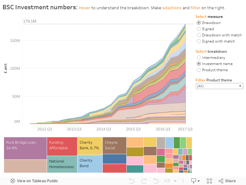
Tableau visualisation (for mobile users)
When we allocate capital, we start with building understanding of the social issue and the drivers of the enterprise model aiming to tackle it. We then work alongside co- investors to target the financial products and intermediaries that can serve that need. That thinking led to our initial 2014 strategy, where we aimed to build a diverse market to better connect investors to charities and social enterprises. As a result over 75% of our investments have so far been into start-up teams, intermediaries or products.
In the visualisation you can see how we have targeted diversity by selecting “Signed” and “Product Theme”. You will see that after our investments aiming to expand the existing non-bank lending market, the next four largest areas (property, equity, SIBs and charity bonds) have been growing emerging products. This visualisation enables you to further explore how we have invested in each of these areas.
For example by selecting “investment name” and then filtering by “property”, the visualisation can show the range of funds we have helped cornerstone, such as the Resonance’s Real Lettings Fund which tackles homelessness with St. Mungo’s. In our 2014 strategy we set out to attract significant institutional capital into our high impact property investments. Looking at the same property filter but selecting “signed with match” then “drawdown with match”, can show how our £81m of signed commitments have catalysed £385m of total commitments or £229m of frontline investment so far.
Another example would be to select “investment name”, “signed” and filter by “non-bank lending”. In our 2014 strategy we set out to increase non-bank lending, including regional and issue-specific funds that would better connect investors to demand. Looking at the numbers will show that this area has been slower in attracting co-investment (signed with match), nevertheless our £127m of signed commitments has catalysed £75m of frontline investments (drawdown with match) so far.
We often hear a debate on whether there are too few investable deals or too little capital available on the right terms. Across our portfolio we see very different demand/supply dynamics in each sub-sector. But in every area we see enterprises who would like better terms, and investors who would like better opportunities. It is tough work bringing those together, and it doesn’t work for every social enterprise model or investor expectations. But there is an increasing amount of activity where social investment is bringing both together to grow social impact, and we hope our data dives can give greater insight in to this.
There is more work to do to connect investors and enterprises in some areas. For example in smaller loans, our co-investment with the Big Lottery Fund into the blended capital Access Growth Fund is just starting to increase the supply, as seen by Big Issue Invest’s #adealaweek activity in 2017. We have also recently launched our new 2017 strategy, which highlighted the three areas where we plan to focus our next efforts to improve lives.
For now, we hope these visualisations can give insights in to what is happening today, and would love to hear feedback on what’s most useful, or from others who have data to share.
In future data dives we’ll be looking at how social investment is being used by charities and social enterprises. Our new deal-level data release will include over 2,000 frontline investments, maps, and categorisation by outcome area and company type. We are planning future visualisations around revenue models, impact metrics and investors. We are also working on collaborations with other data sets such as 360 giving, to give greater visibility and understanding in how social investment sits alongside other types of funding.
If you are a charity or social enterprise considering if social investment is right for you, Good Finance is a useful source.
Our Data at Big Society Capital page gives more detail on our data sets, their design and how they fit together.